The Best Squarespace Template for Life Coaches in 2026 (And the One Thing Most Coaches Don't Think About)
What a great coaching website needs to actually book clients
Most coaches don't get stuck because they can't find a Squarespace template for life coaches. They get stuck because the template gives them too many options and not enough direction.
Every section feels like something you're supposed to fill in, so you end up adding things your visitors don't actually need, and an effective coaching website doesn't need everything. It needs less. People's attention spans are short, and if you bombard a new visitor with information before they're ready for it, they click away before they've even figured out what you do.
The fix isn't more sections. It's clear guardrails that tell you what to include and, just as importantly, what to leave out. That's exactly the gap I want to close in this post.
If you go by pages, here's the bare minimum:
A strong homepage that shows everything at a glance
An about page
A services page
A contact page
A book now page
A blog
I almost left the blog off that list, but it earns its place. With coaching and therapy specifically, people are usually trying to work through things on their own before they ever reach out to a professional. A blog is one of the best ways to build trust with someone who isn't ready to book yet.
It shows your tone of voice, your style, and gives them a real sense of what working with you would feel like. It shouldn't read clinical. It should sound like you. And when it does, booking with you becomes a natural next step, not a cold ask.
One feature worth knowing about: Squarespace lets you gate certain blog posts so only paying subscribers can view them. That's available on every Squarespace template, including premium ones. If you want to run a paid content series, almost like your own Substack but one you fully control, this is built right in.
What goes on your homepage
Lead with a strong call to action, something like "ready to level up?" or "let's break those bad habits." You want a section that signals what you do clearly enough for SEO, and you want a way to book right from that first section.
Some of your visitors have already been referred to you. They just want to book. Don't make them hunt for the button.
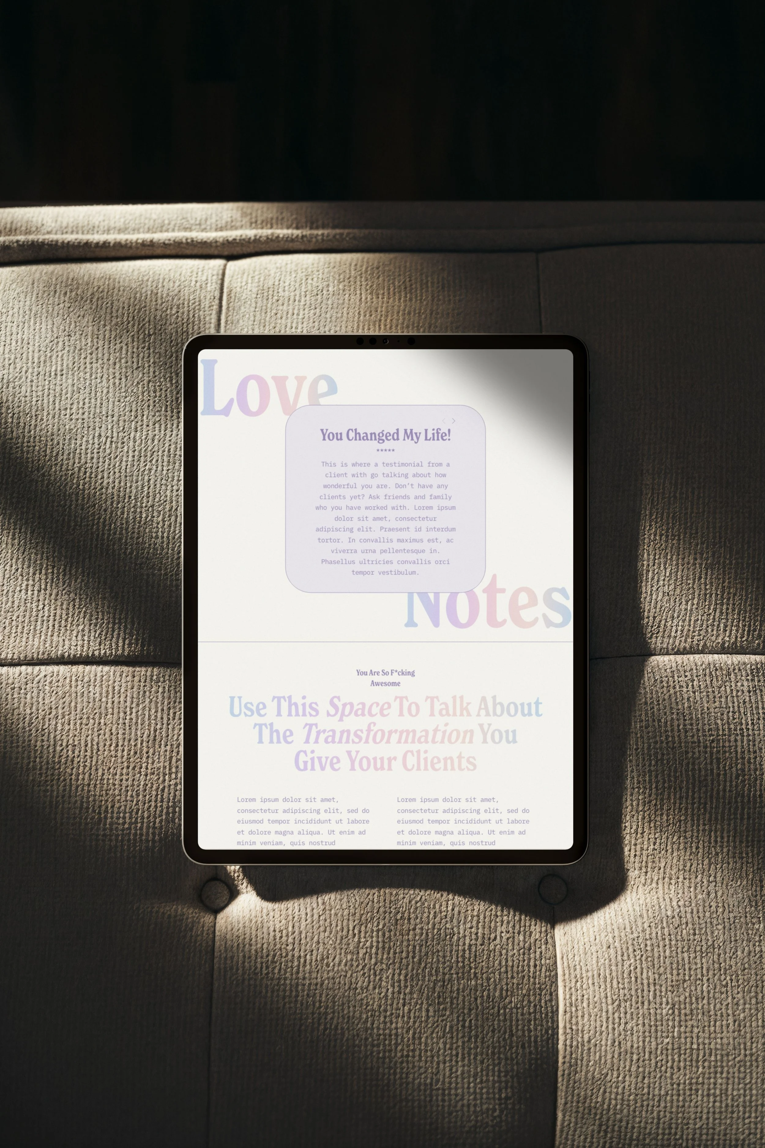
After the call to action, add a quick introduction that invites people to learn more on your about page, followed by testimonials. As much as you can say about your own results, it lands differently coming from someone else.
Then a short section, just one or two paragraphs, on the transformation you give clients. This isn't about you. It's about where they start and where they end up.
Add a brief "how to work with me" overview so visitors can see at a glance whether you offer hourly sessions, group work, or something else.
Feature a blog post on the homepage too, for visitors who aren't ready to book but want to learn more in a low pressure way.
And include an actual contact form right on the homepage. In coaching and therapy, reaching out can feel like a big step, so capture people while they're at their most interested rather than hoping they find their way to a contact page later.
Don't skip the newsletter signup
One more element I recommend on every page, not just the homepage: a newsletter signup.
You don't own your audience on social media. The algorithm can change overnight, and ninety percent of your followers might never see your next post. An email list is yours. It can't be taken away.
It doesn't need to be complicated either. A weekly feature of your newest blog post or a short motivational note tied to your specialty is enough to keep you top of mind.
Your about page
Open with a short, personal tagline, just enough for visitors to get to know you and start to like and trust you.
Follow it with a slightly longer section about your business, your skills, and what you specialize in. Keep it brief here. Save the deep dives for blog posts that can be broken into bite sized chunks.
Then add a qualifications section. You don't need to over explain it. Just list the qualification with a brief note if it needs context, especially if it's an award or certification visitors might not recognize.
Your services page
Start with a frequently asked questions section. What do people need to know before they book? What do you get emailed about most often?
If you're not sure, ask a few friends what made them hesitate before booking a coach or therapist. Answering those questions upfront means fewer repetitive emails for you, and it reassures potential clients that they're not the only ones wondering.
After the FAQs, list your services in more detail than the homepage allows. What to expect, how long sessions run, and a clear call to action to book a consultation. Don't make them scroll around looking for the booking link.
Your contact page
A dedicated contact page still matters, even though some sites have started skipping it. People look for "contact" in the top menu out of habit.
Include an easy form, your email address, your phone number if you're comfortable sharing it, and if you have a physical office, a map, your address, your hours, and any parking or access details.
Where to put your social media links
The contact page is where I recommend placing your social media links, not on the homepage.
A lot of coaching sites feature Instagram or TikTok prominently up top because social feels like the path to more clients. But it works in reverse. Social media should point people back to your website. Your website and your newsletter are what you actually own.
When you put social links front and center, you take visitors who've already reached the point where you want them, your site, ready to book, and send them off to a platform you don't control, where it's easy to get pulled into someone else's content.
Keep your social links, just place them logically under your contact information instead of front and center.
Your booking page
The one truly non-negotiable page. Your booking page needs more than a calendar. Include your booking policies:
What clients need to know before they book
Your rescheduling and cancellation policy
Your payment methods
Sorting this out upfront saves you headaches later and helps potential clients feel more secure before they commit. Nobody wants to book and then wonder, "what if I need to cancel next week, will I get my money back?" Front-loading that information builds trust and removes friction.
This matters even more in coaching and therapy, where feeling safe with you is part of the decision to book at all. Clear policies create a sense of safety, even if your visitor doesn't consciously register why.
From there, either embed your existing booking system or use Squarespace's built in scheduler if you don't have one yet (it does come with an additional monthly cost).
And add a book by phone option too. Even with online booking available, some people simply feel more comfortable on the phone. In a personal industry like coaching, knowing a real person will pick up adds a layer of trust, whether they end up using it or not.
What most coaching templates get wrong
Here's something I see constantly. A template looks genuinely beautiful on the demo site, but when you start editing it, every section just says "your text here" or some version of generic filler.
No one can tell you exactly what to write. You know your business better than anyone else. But you do need to know what each section is supposed to be doing, and a pretty header with no direction underneath doesn't tell you that.
Lorem ipsum placeholder text is fine if the section header itself gives you direction. But if there's no guidance at all, what you're left with is a nicely designed section that isn't actually built for your industry. It's not part of a cohesive website made for coaches specifically, it's just a pretty template that happens to have a coach-shaped demo loaded into it.
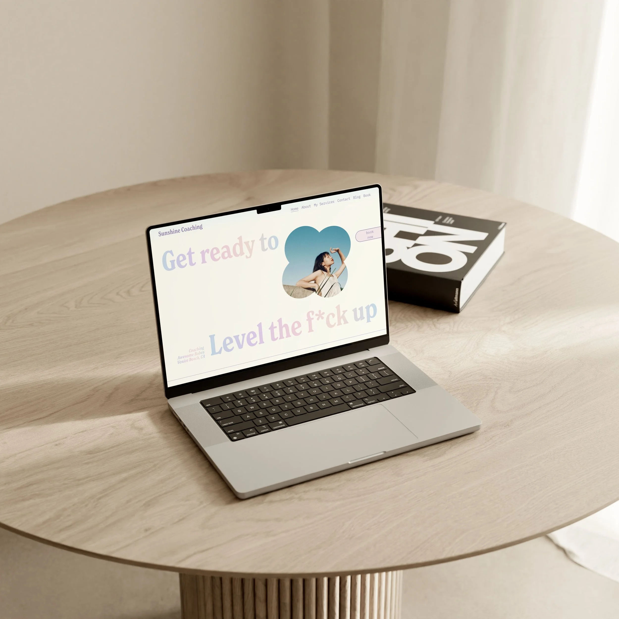
So what if the template itself told you exactly what each section needed to say, and why? This is exactly the gap Sunshine Coaching was built to close.
The Sunshine Coaching template (and what sets it apart)
A guided content framework, not just placeholder text
The placeholders in this template aren't generic filler, they're written as live examples you simply swap out. The homepage hero might read "get ready to level the f up." You can keep that energy or rewrite it as "ready to let go of what's holding you back?" whatever fits your style. Right next to it, a smaller line like "coaching awesome babes" becomes "coaching entrepreneurs in San Diego, California," or wherever you're based.
Some examples of what the prompts look like throughout the template:
The about section reads "a short tagline goes here, what are you all about?" so you fill in something like "marriage counselor for entrepreneurs"
The paragraph beneath it prompts "introduce yourself to potential new customers, what makes you special?"
The transformation section prompts you to "talk about the transformation you give your clients"
The booking policies section gets specific, prompting "detail your appointment policy here, do clients need to arrive fifteen minutes before their appointment?"
Every section either gives you a fill in the blank prompt or a worked example showing you exactly what's expected and how long it should be. You're never staring at a blank page wondering what goes where.
A design built for an industry that's hard to photograph
Coaching is a tough niche to shoot photos for. It's not a visual industry the way a salon or a product brand is, so we kept the photography intentionally minimal and let typography carry the design instead.
The custom-coded gradient font is the standout feature here. It adds a distinct, designed feel to a text-heavy page without needing to lean on stock photography. You can keep it in your brand colors, shift it to feel more moody and serious, or turn it off entirely if you want something more clinical. It's a flexible feature, not a fixed one.
Beyond the font, there are small intentional design touches throughout, soft shapes and borders around images, a "love notes" section that's text-only but still has a distinct, full personality, and a subtle, guided use of color throughout. It's minimalist, but never sterile.
Built to award-winning standards
Both the design and structural decisions in this template aren't just things I think look nice. They're the same principles that earned my work CSS Design Awards for Best UX Design, Best UI Design, Best Innovation, and a Special Design Kudos, along with an SSW Star Award. Coaches buying this template are getting design decisions that have been judged against an international standard, not just my own opinion of what works.
Free alternatives worth knowing about
Squarespace doesn't actually have a dedicated coaching category, so your best bet for a free starting point is browsing the personal and CV website templates instead. Here's an honest look at a few I'd point a brand new coach toward.
Cole is technically built for personal trainers, but it's a solid first start. It has training plan sections, a "150 clients trained" style social proof feature, a testimonial section, a book a session button, and a contact page right up front. You'll need to do real work adapting it from a fitness angle to a coaching one, but the bones are there.
Byron is actually a coaching template, and it has a strong hero section with a clear call to action, plus about, services, and process sections that walk a visitor through your offer on the homepage. It has a scrollable testimonial section too. The booking button isn't on the homepage by default, though you could add it. The bigger limitation with Byron, and a lot of free templates honestly, is that only the homepage is really built out. It gives you a feel for the style, but it doesn't come with the full set of pages or the content guidance you'd need to actually launch.
Myhra is built for a nutrition coach and has more pages worked out than most free options, a services page, a coaching page, and a recipes page styled like a blog. The recipes page is a great example of what's possible with Squarespace's blog gating feature, since you could use that same setup to host a paid content series. It's still designed around recipes specifically, so you'll need to adapt it to your own offer, but it has a "work with me" section and free consultation CTAs that give you a useful head start.
All three are genuinely good places to start if you're not ready to invest in a premium template yet. Just go in expecting to do some real customization work, since none of them were built specifically with a coach's full site structure in mind.
How to choose the right template for your coaching brand
The real question isn't really new business versus established business. It comes down to three things: how much you want to build yourself, how visual you want your brand to feel, and how much value you place on a polished look right out of the gate.
If you genuinely enjoy design and coding, or you already have a clear vision for sections a template simply doesn't offer, DIY can be a fun project and a free template is a perfectly reasonable place to start.
If design and code aren't your thing, a premium template is almost always going to be the stronger starting point. It accounts for Squarespace's quirks, things like tablet formatting and blog spacing that you can't fully control in the native editor, and gives you a level of polish that's hard to replicate from scratch.
Cost matters here too. If spending three hundred dollars genuinely isn't an option right now, free is a completely valid choice, and you can use premium templates as a style reference while building your own. But if you can spare it, starting from an established, professional foundation means you get to spend your time on content instead of fighting with design decisions.
And consider how much your clients actually care about aesthetics. If most of your business comes from referrals and people just need a simple way to book with you, a basic DIY site might be all you need. But if you're actively trying to attract new clients online, a polished, professional looking site adds real credibility the moment someone lands on it, and that's exactly what Sunshine Coaching was built to give you.
Frequently Asked Questions
What is the best Squarespace template for a life coach? I'd say the Sunshine Coaching template, because everything is already set up for you while still being easy to customize for your specific brand. A lot of coaching templates lean on long, heavy sales pages, and honestly, clients are getting fatigued by that approach. It can feel pushy and a little inauthentic. Most coaches do better with something more concise and clear, which is exactly what this template is built around.
Do Squarespace templates for coaches include a booking page? Yes, ours does, and one of the most important parts of it is that it sets expectations upfront, FAQs, your booking policies, all of it. The booking page is open ended too, so you can embed a form from whatever booking service you already use, add a button linking out to your booking page, or even include a button that connects directly to your phone number for clients who'd rather book by call. Any booking service can layer on top of these templates, though most do come with their own monthly cost.
What should a life coaching website include? At minimum: easy ways to book with clear calls to action, a strong sense of who you are and what clients get from working with you, testimonials, clear service offerings, and a blog that gives visitors a feel for how you work. You can even repurpose existing client resources as blog content, or turn one into a downloadable PDF in exchange for an email address to grow your list. Add a newsletter signup, a skimmable about page (you really don't need your whole life story here), a services page with its own FAQ section, a contact page with multiple ways to reach you, and a book now page that's accessible from every single page on the site.
Is Squarespace good for coaches? Absolutely. It includes a built in booking system if you don't already have one (available as an add on), a newsletter tool for a monthly fee, and everything in one place so you're not juggling five different subscriptions. It's easy to update yourself, you can upload downloadable resources for clients, and it covers everything most coaching businesses need for a reasonable monthly cost.
What makes a coaching website convert visitors into clients? Trust, more than anything else. Coaching is an intimate exchange, so visitors need to feel like they know you and that you're real before they'll commit. That's part of why a blog is so valuable, it works almost like a mini session, naming a problem and walking through how you'd help solve it. Small trust signals matter too: a visible phone number even if most people never call it, clear and transparent policies that quietly set expectations before you've even spoken, and a clear call to action wherever a visitor might want to take the next step, whether that's learning more about you or booking a free consultation.
Can I use a Squarespace template if I have no web design experience? Yes, and a premium template is actually where you'll see the most benefit if you're starting from zero. The design work is already done. You're swapping in your colors, fonts, photos, and following the built in prompts. My templates also come with an AI resource trained specifically on Squarespace plus step by step video tutorials, so you're never stuck wondering what to do next or whether something will look right on mobile. The learning curve is short, and the custom coded elements can be applied or removed directly through the editor, no code required.
How is a premium Squarespace coaching template different from a free one? You can absolutely get by with a free template. The difference with a premium one is that it's been designed with intention, thought through for SEO, for user experience, and for how people actually move through a website, not just how it looks. It comes with the components coaches specifically need already in place, so you're not guessing what belongs on the page or adding things just to fill space. You get the polish of a professionally designed site alongside SEO and accessibility best practices already built in.
Ready to see it for yourself?
Go check out the live demo of the Sunshine Coaching template. It's the best way to see exactly how the sections are laid out and how the guided prompts work in practice. Click through the whole site, view it on desktop, tablet, and mobile, and get a real feel for how it looks and works before you decide.
Password: demo